New Styling: Popup and Embedded Checkouts
Overview
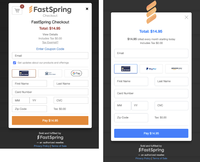
We updated the popup and embedded checkout’s default styling to provide a cleaner experience. The new default styling only applies to newly created popup and embedded checkouts. The changes include:
-
Decluttered checkout: All optional fields (checkout title, cart, tax exemption, coupon, email offerings) have been disabled by default to give a cleaner first impression. These fields can be enabled anytime by the seller.
-
Better mobile experience: The input fields height has been increased for ease of use on mobile.
-
Neutral styling: More neutral styling (blue) instead of FastSpring branding (orange) has been introduced to help sellers better envision the checkout fitting within their site.
FAQs
Will my existing checkouts be impacted by the new default styling?
No. All existing checkout styling will be unaffected by the change. They will look and behave exactly the same as before. Only newly created popup and embedded checkouts will have the new default styling.
Which checkout types will have the new default styling?
Popup and embedded checkouts have the new default styling. Web storefront checkouts default styling was not updated.
I’m an existing seller with FastSpring. How can I get this new default checkout look and feel?
If you’d like to take advantage of the new checkout style, all you need to do is create a new popup or embedded checkout in your "Storefronts" section. Any newly created popup or embedded checkout will have the new look and feel.
What’s the difference between the old and the new default styling?
Please see the below screenshot for the before (left) and after (right) look and feel.

Updated about 1 month ago